Accent variation is a complex and fascinating area within linguistics. The sound of our speech is influenced by the communities and groups we belong to, places we come from and physiological factors, among other things. The UK has a large range of accents with distinctive phonetic characteristics. For example, the vowel in ‘class’ rhymes with ‘cat’ in the North and with ‘cart’ in the South. In my dissertation I study these North-South accent differences by analysing speech recordings of this vowel.
If you say the words ‘cat’ and ‘cart’ aloud, you will notice that your throat and mouth are positioned differently to produce each vowel. The shape of your vocal tract makes certain frequencies stronger and others weaker. This difference in the ‘frequency profile’ of each vowel is what distinguishes them to a listener.
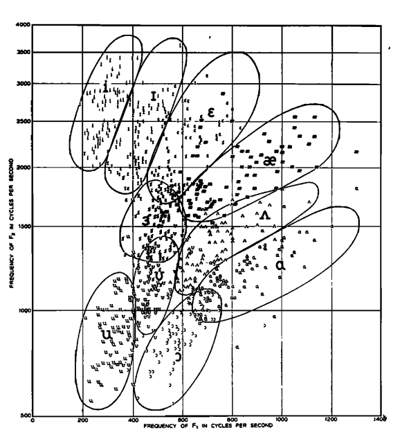
In phonetics, a useful way to characterise vowel sounds is with the two strongest frequencies in the sound, which are called formants F1 and F2. A famous diagram made by Peterson and Barney in 1952 shows vowels clustering in different parts of the F1-F2 formant space. We’d expect that the ‘class’ vowel spoken in different accents would therefore have different F1 and F2 values, corresponding to which frequencies are emphasised in the vocal tract.
I collected a dataset of speech recordings by 4 speakers repeating words with the ‘class’ vowel several times each, in both Northern and Southern accents. I wanted to recreate Peterson’s formant plot with this data, using animated formant paths instead to visualise the difference between accents. (I also just wanted to try out the gganimate package after seeing some lovely GIFs on Twitter!) Here it is!
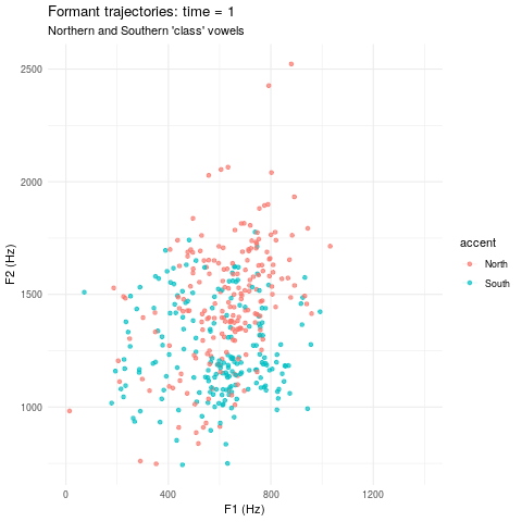
Each point is one sound recording and it moves as the main frequencies change over the duration of the word1. It’s nice to see the clear difference between accents.
The sounds were normalised to be the same duration to make them easily comparable.↩